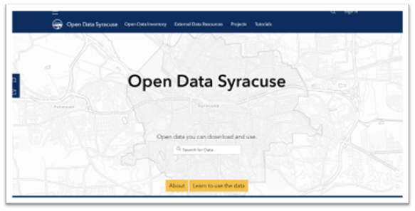
One of the skills that we have in our team at the Office of Accountability, Performance & Innovation (API) is quickly finding, pulling, and using data about city operations and services. We use this data to build dashboards that track performance and make maps that staff can use to address questions in real-time. The use of this data isn’t just valuable to our departments for internal purposes, it’s also meaningful to our community members as well. There are many reasons our community members appreciate access to this data that we collect. To ensure that we are sharing the data with them in a way that is easy to access and understand we have been busy collecting resident feedback on Open Data Syracuse, our city’s open data portal. Open data portals allow residents to view important city information and data, including budget documents, crime statistics, property assessment information, and information regarding services that the city provides. This information is provided free of charge without community members needing to make a Freedom of Information Law (FOIL) request.
How we are collecting user feedback
A few of the ways that we have been collecting user feedback is through in-person sessions with resident groups and with individual user testing. The goal of these methods is to:
Better understand how residents access city information on the Open Data Portal
Better understand pain points that users may experience while accessing the data
To help with this, our team has held four Open Data Overview sessions for neighborhood groups and two individual user testing sessions. During these sessions, residents were given sample tasks that included going through the Open Data Portal and trying to find specific information. One of these tasks included looking up the amount of crime in a potential neighborhood that a resident was looking to move into. As our participants moved through each task our team observed how easy or difficult it was for them to access the different city information.
During these sessions we also collected suggestions as to how we could improve our Open Data Portal, where many of them provided us with improvements that could be made and new features that could be added like making it easier to tell when a dataset was updated. Through our interactions many residents and community members expressed appreciation that information and tools like this are available to them
What we’re hearing
Although improving our resident user experience is an ongoing process for us, we wanted to share some of the changes that we have made based on resident feedback and recommendations we’ve collected so far. Some of the points of improvement that have been identified at neighborhood groups and at the user testing were the following.
There was not a clear way to get to Open Data Syracuse from the main Syracuse website
On the front page of the Open Data Portal Website, there was not a clear way to navigate back to the home page
On the front page, it was not clear that if you scrolled down there was more information on the first page
There was no easy way for residents to find out what their trash pick-up day was.
Information that makes it easier to look up who your Common Council representative
Improvements we made
The feedback that we received fell into two main categories. One is making the often table-based data easier for a broad range of community members to interact with and explore. The other involved making this information more able to be utilized by community members that already have data skills and would like to use this for analysis and visualizations. To help make Syracuse crime statistics easier to understand, we geocoded this information (which is taking data in address form and mapping this out to latitude and longitude points) so that it can be displayed on a map.
We also used a map of Common Councilor boundaries and made a map of Syracuse Common Councilor assignments and contact information
We added links from the main City of Syracuse website to the Open Data portal
Added a Home button to assist in navigation
We added an icon at the bottom of the home page to show users there is more content and this will automatically scroll users to the next section on the page.
For datasets that we are updating through regular updates, we are changed this to clearly show in the subtitle the date that this information was updated (see image below)
Our Next Steps
There is more feedback we’ve collected that we’ve not yet had the opportunity to implement. For example, on mobile devices, our maps do “double scrolling”. This is when you are scrolling down and come to a map and try to keep scrolling, it will stick on the map and make it difficult to scroll below that section of the page. Not the most user-friendly. We will continue to work on this and other recommendations to help continue to make Open Data Syracuse a valuable resource not just for data analysts and developers, but for residents that just want to learn more about their neighborhoods and the city’s services. We look forward to continuing to partner with residents who are willing to help us provide better access to city information.
If you have ideas on how we can continue to improve Open Data Syracuse, please let us know at opendata@syrgov.net.


